Explain your choice for the company you created. Why this particular company?
I chose to create a fictional space exploration company, similar to Space-X. I chose this company specifically due to my interest in space in general.
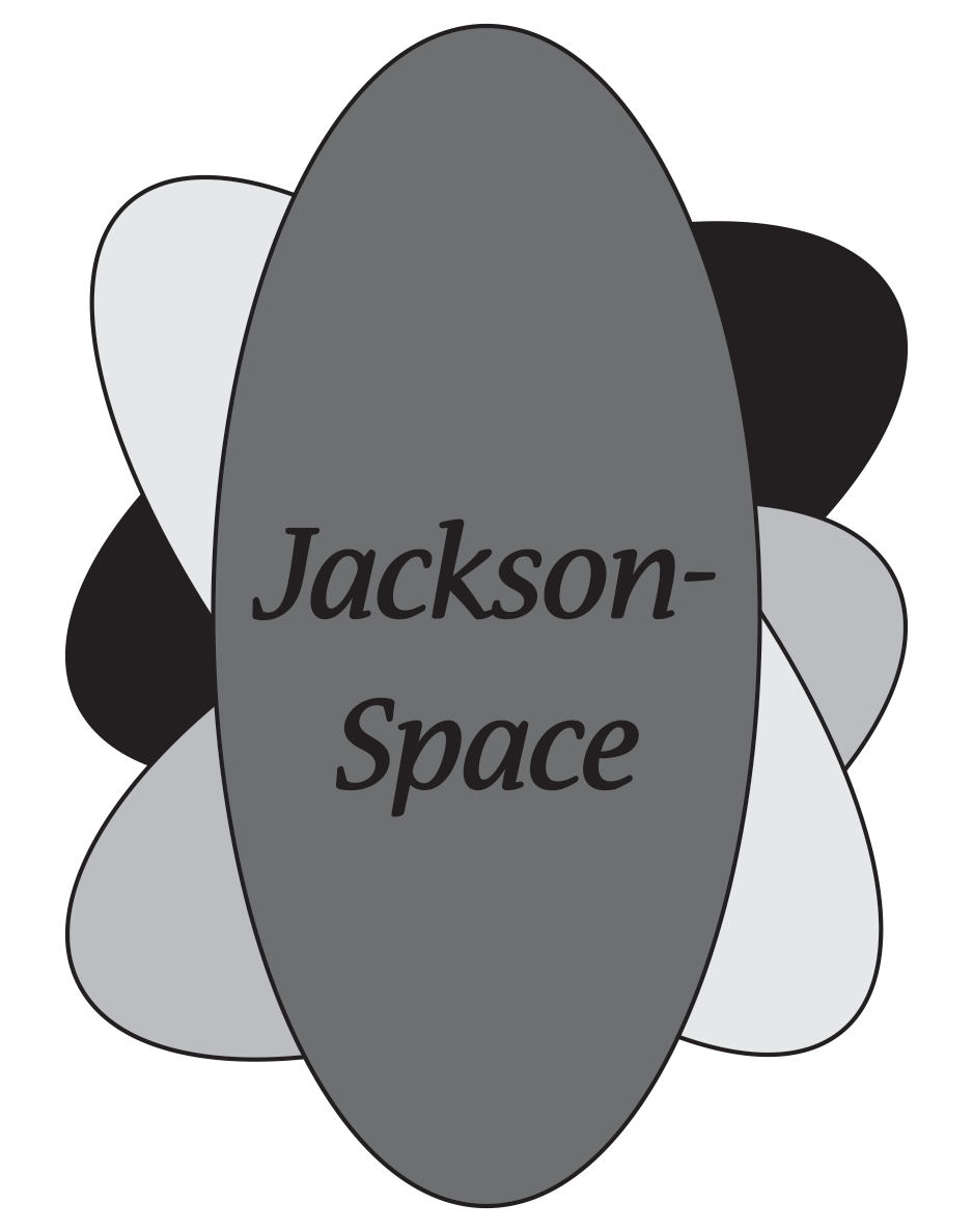
Explain the logo - how did you tie in your company identity through your graphics?
I tied my company identity by combining multiple ellipses to create a logo which pops out and gets viewers attention.
Explain your selection of font - the text you used for the name of your company
I tried to italicize the text on my business card to make it stand out more. I didn't use any real fancy fonts in any of my designs for my company.
Explain your color palette.
The colors I chose were Black, Dark Green, Yellow, and Yellow-Green. I chose these colors as they each make one another stand out more so and are a simple color scheme.
Do all of your company items, business card, envelope, letterhead and animation look like a matching set and how did you make sure of this?
I ensured all my company items would look like a matching set due to the specific color palette I chose.
What was the biggest struggle during this project?
My biggest struggle was creating the letter-head, as I wasn't entirely clear on my idea for that.
What is your favorite part of the project?
Making the GIF.